
From the lyrics of Mental – Grand Corp Malade.
Only when the last tree has died,
and the last river been poisoned,
and the last fish been caught,
will we realise we cannot eat money.
— Cree Proverb.

If you wish to have this illustration on your desktop click on this link to download it in a desktop friendly format.
I already have it on mine:


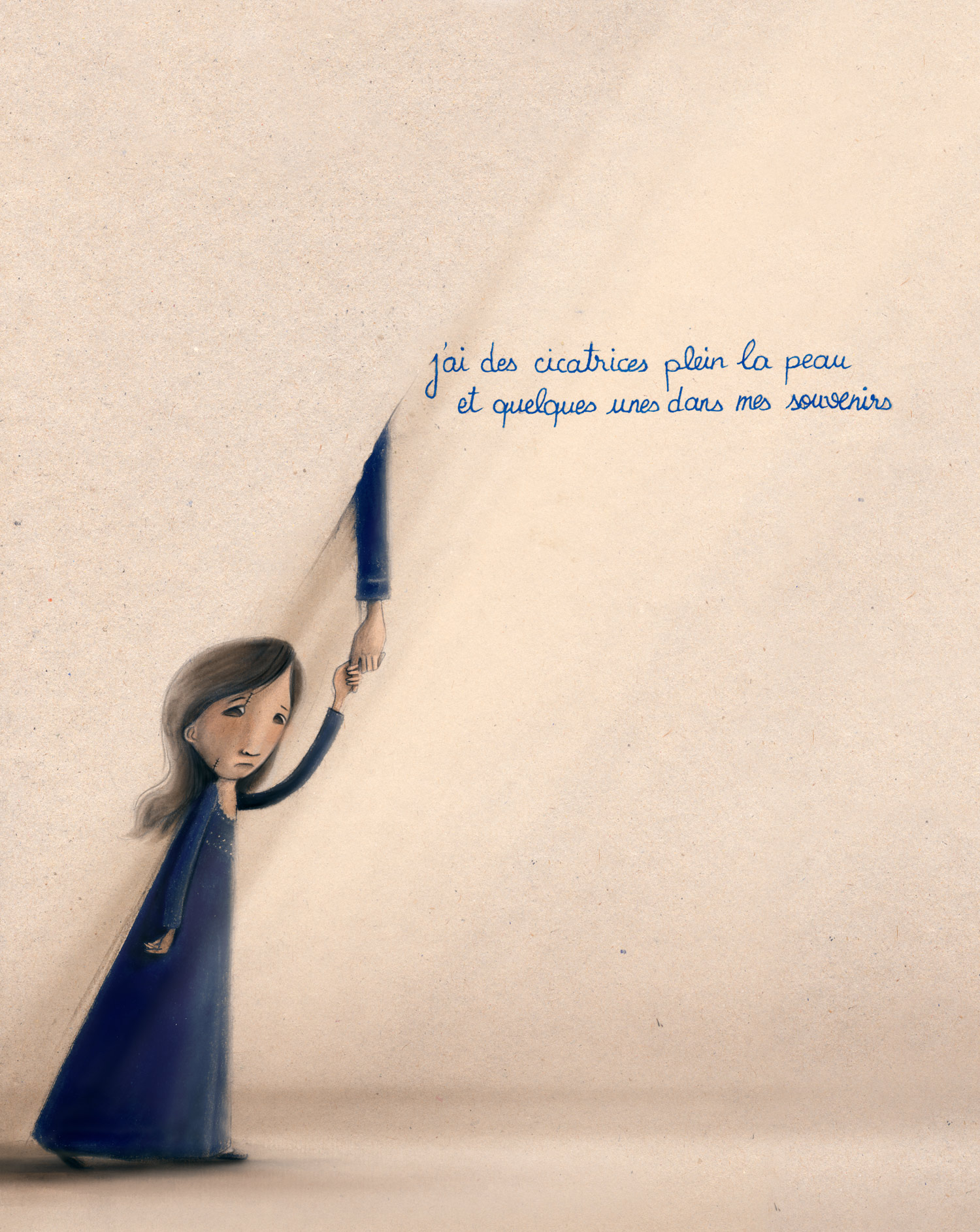
 < Inspired by this photograph of Palestinian Refugees. < Inspired by this photograph of Palestinian Refugees.

I made it as a desktop image on my Mac.
Have it on your desktop too!
Click on this LINK to download it with textured background, or on THIS one to download it with a white background.

20th of june is the World Refugee Day. and this is an illustrated calendar desktop for june 2011, that you can download by clicking on the picture above.
after stating the obvious, comes some more interesting details  what is this illustration exactly? and why now? what is this illustration exactly? and why now?
this desktop illustration is part of the social calendar project initiated by COSV. in october 2010 and in a previous collaboration with COSV Fouad and Rafic at the Lucca Comics & Games Festival, the people at COSV felt that the team we created was a great team with great talent. and they wanted to do a project that continue joining us together, even after going back to lebanon after the festival. so they initiated this project where each month an illustrator does a desktop image for a specific world social day in that month. the desktop images are then sent by email to many people over the world.
i always felt that drawing is a tool in my hands, even more like a gift, that i should be using for good causes. this project makes me somehow fulfill this sweet responsibility.
the following where my words when COSV asked me to explain about my drawing:
through this illustration i am trying to get an emotion across to you as a viewer. to make you put your shoes in the shoes of the refugees in the illustration. what if you were forced to leave your house your land and all your past behind?
hoping that this will leave you with a sense of empathy and a will to spread the word about this social injustice.
down there some details snapshots:


feedback is always appreciated. so tell me what you think about the illustration?
does it really get the feeling across?
also something that i would like to ask your opinion about:
for a second while drawing i thought that this illustration might be useless, thinking that it wouldn’t change the situation of any refugees in the world. but then it i realized that if i am not in a power of doing anything towards this social injustice the least i can do is acknowledging these people, telling them that we’re thinking about them, and that we know what it means to be in their position.
so, what do you think? have you ever also had these thoughts?
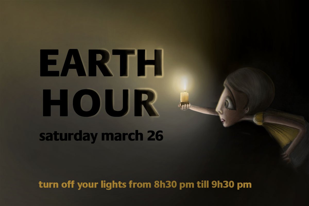
“one person has the power to change… but if we come together we can change the world.”
i am turning off my lights from 8h30 to 9h30 this saturday and lighting up a candle instead.
join me to make a Much bigger difference. and let’s imagine what we can do if we go beyond this hour!

i am taking this small action because i care bout the earth and i am aware that climate change is the biggest threat to living beings, and that we should take action. and i am hoping for this action to become a daily habit and for more actions to come…
i am also very happy to have an evening without screens and internet and social networking and… and..
let me know if you are gonna take this small action as well. and what are you gonna do during this hour
learn more about the Earth Hour
visit the Earth Hour website
this is one of the article illustrations i do each month for mawhiba magazine.
this one about banu musa.


mar7aba jami3an!!
i am back to blogging
enjoy the new look and the new posts!

i read something for Ken Robinson about the educational system that touched me and intrigued me, so i decided to draw and talk about it.
i used to be very bad at school..
not a very long time ago i discovered that there is a thing in life that i am good at.
a fact that surprised me as i was not used to be “good” at anything :p
now i know for sure about what i love, what i am passionate about, and even addicted to.
but why did take me so long to discover this?
what was i doing during the past 19 years?
how did i improve this “thing” -that i believe- i was born to do, during school?
here are some excerpts from Ken Robinson’s speeches/books:
“an awful lot of people go through education & never discover anything they’re good at at all. we’re all born with tremendous creative confidence and abilities.
young children are full of great ideas and possibilities.
but that tends to be suppressed as we get older. we’ve been educated to become good workers, rather than creative thinkers.
we are educating people out of their creativity…
and it happens in part through this culture of standardised testing that I think is now a blight on the whole of education.
human development is not linear and standardized, it is organic and diverse.
people, as opposed to products, have hopes and aspirations, feelings and purposes.
education is a personal process.
what and how young people are taught have to engage their energies, imaginations and their different ways of learning.”
click here to watch a TED talk by Ken Robinson
for those who are as well intrigued by this subject, William recommends that we read:
“The Element: How Finding Your Passion Changes Everything” Sir Ken Robinson
“Linchpin. Are You Indispensable” Seth Godin
i heard a lot about these books and read some excerpts. they for sure are some very insightful, inspiring, and even life changing books!
i am one of the actors performing in this play.
as the poster is saying, this is not a play, it’s a series of scenes.
each one of us conceived his own scene, his own message, vision…
and this translated into dramatic, spiritual, romantic, dreamy, energetic and comic stands…
…something you will definitely enjoy!
i will not talk more about it, will leave you make your own impression after watching it 
for those who are asking who we are:
we are a group of young people that have been attending a 7 month workshop at L’Atelier du JE. some of us decided to go on stage. “w stor ma shefet menna” is what came out
the play is supervised by Patricia Nammour and Câline Bernoty.
here’s the event on facebook.
here’s a beautiful article written by Rawad el Hoyek about the play

i did the designed the of the poster, as part of team .:there for design…
you can click on it to enlarge it
so much to share about this (experiences, videos, links, photos, photos, photos…).
i’ll share them after our last show.
P.S. reserve asap, because places are running out
call 01-363 328
don’t miss it!
if you already watched it, write your experiences in the comment.
i am sure you’ll explain about it much better then i do :p

i won a trip to italy in let’s comics competition.
so i am going to lucca (tuscany) in november to the lucca comics and games fair.
yeaheeeeey!

lucca is very famous for its intact renaissance-era city walls… the old town remained intact as the city expanded and modernized.
i am so excited for that trip!
starting to prepare from now… 

the brief of the competition was to give your point of view about ‘multicultural societies’.
here’s the story i presented:


.
did you know that cockroaches have family & friends which they recognize by their distinctive odors

• they have faster reflexes than humans; even faster than Michael Jordan’s
• they have one great big nerve on tails alerting them to danger from behind
• they breathe through their sides – not their noses
• they are able to make group decision-making and competition exists in cockroaches’ world
• a cockroach can live up to a week without its head. it only dies because it can’t drink
• they have a mosaic vision, which is excellent at detecting motion
and what we just do is kill it!

“alert everyone! alert! please do not enter room! a cockroach is living inside with it’s wife and kids. please evacuate the building… ”
“best way to kill cockroaches: hit it so hard so that you don’t hear its sound cracking”
they never killed poeple or raped girls. so why this mission of eliminating all cockroaches
why not like just holding it and putting it outside. w khalas!
here are some of the illustrations for “موهبة” Mawhiba’s monthly article.
this issue is about Alhazen.
of all articles i enjoyed this one the most, since i had the chance to experience bits of the arabic magical mood, old cloth…


another article illustration for “موهبة” Mawhiba (Saudi magazine aiming to encourage young talented people); this time about Graham Bell.
Bell was obsessed with sounds from since he started reasoning. the article tells how he was trying once to hear the sound of the corn plant growing up…
here’s where the title page illustration is from:

some illustrations from the article:


i took a workshop with jorj abou mhaya (a great illustrator) where we focused on characters illustration (some history, tips and practice…). jorj is giving now a workshops on sketching & the drawing basics. if you are interested this is the links on facebook
i had some time this weekend to scan some of my sketches and share them with you.. enjoy!
you can click on the last one to enlarge.. it’s much better on bigger scale.


i was one of the participants of the project: Beyroutes, A guide to Beirut. the result of the project is a book that was launched last saturday (6 march 2010).
Beyroutes, unlike any other guide to Beirut, presents a whole different way of touring in Beirut… a way that takes “the human infrastructure as a point of departure”. it offers a variety of subjective explorations of the city and it’s layers. it shows the “complexity of how one gets to know this city, its inhabitants, its buildings, and everyday life.”

i was one of many other illustrators, photographers, writers, artists… that were asked to explore a chosen region inside Beirut, to have a personal understanding of it, and express it in our way.
following is my contribution to this project. you can click on the image for a bigger view and better read

crops from the artworks:


this guide project and it’s preceding workshops were an initiative of the members of Studio Beirut, supported by Archis, Partizan Publik, and the Pearl Foundation.
here are some teasers of what you can find in this guide

this was a very small project for a friend Khajag Apelian who did his masters in type design. Khajak designed Arek -the type face that you can see in the pictures- as as a thesis for his masters. it’s an armenian typeface specifically designed for school books. for his type specimen book he chose two stories to illustrate:
La Fontaine – The Crow and the Fox . the second is an armenian tale about a mouse that lost her tail
so i did the following pencil drawings..


“موهبة” Mawhiba is a Saudi organization aiming to encourage young talented people and helping them develop their talents.
i illustrated an article inside a monthly magazine for Mawhiba organization; the magazine also called Mawhiba.
the article “Edison before Edison” talks about the life of Thomas Edison, with a focus on his childhood and some of his adventures.
above is the first option i presented to Mohtaraf (who was commissioned to redesign the magazine), but it turned out to be too childish, so i did the following:
(i know the above is more attractive, but you have to take the audience into consideration)

what absorbed me the most in Edison’s life is the unconventional child that he was and his strange ideas. once his parents caught him sitting on swamp’s eggs… he was convinced to get baby swamps that he would’ve made
here are some pages of the article

i was part of the team who worked on Vitrine’s visual creation, and communication material. and i have to say the crew working on this play is amazing!
i learned a lot during the process starting from Nehmeh’s patience and calmness even under stress, David‘s visual expertise, William‘s conceptional creative mind, and Elias calmness.
am going to watch today the final rehearsals and am already excited to see Joulia & Aida, the costumes, the make-ups, and hear Christelle Franca’s music (who’s gona be playing live btw).
go and watch it, great minds, great expertise, great artists, are behind that performance!!
it’s gona be played every thursday, friday, saturday and sunday at 8:30 pm
at Al Madina theatre starting tomorrow.
this is the poster, click on the image to see high-res image

some applications (flyer, bookmark, invitation card)

here’s the bookmark which was done before the poster on a very tight deadline

and the dusty window that i stole from a construction site near our studio
yes i returned it back! no i didn’t! haha
it’s where we erased the word Vitrine from.


christmas is all about show off and over-consumption for me. this is not the message behind this painting although i called it “christmas painting”; actually no christmas messages are intended in it. but this is rather my solution for what i hate in christmas. i went with the movement saying: do your gifts instead of buying them. and here’s my present to my beautiful big sister.
by the way i just noticed the green + red colors of the painting… yes a complete coincidence

detail with the shadow of some cloth

painting + camera + lighting + photoshop wouhououou that’s the best!

some sketches

i was part of the team working on the process of the new initiative by casfekra: createseats.com
in short the idea behind createseats is this: instead of buying those generic passe-par-tout gifts, casafekra aims to help create “thought-of” personal gifts that leave people feeling appreciated. read more on the blog post of casafekra: “the one with the personal secret…”
for this .:there for design… came up with the concept of “lamiss” the ashamed ostrich. “lamiss” was a perfect representation of the feeling people get when they give those lame gifts. that’s because when the ostrich puts it’s head in the ground, most people perceive it’s action as shame or fear.
bref, i did the illustration of the first draft visual of the idea (at that time we were still thinking that “lamiss” is a person)

and i then worked with team .:there for design… developing the visual.
bellow you can see some of the visual process. to see the complete process, visit blog .:there for design…

and here’s the final result

the fun part was in the process! collecting tree leaves, dried fruits and flowers from a public garden next to our studio, cutting, gluing, photo-shooting, photo-retouching. again you can see it all on blog .:there for design…

|
|


